


Was design better in the eighties, nineties, and aughts?
Yes and no. Mainly no.

At least once a week I come across a video essay like this and I end up watching most, if not all of it. Overall, I’ll agree with the premise, but it’ll miss the fact the design that was more mainstream/visible (due to the fact they weren’t even alive during the eras they’re waxing nostalgia on) was just as crappy as some of the stuff that’s out there now.

Sure there were interesting things happening in the 80’s like Memphis design and S deco, and the whole grunge aesthetic and the dreaded coffee house village style of the nineties. Then in the late nineties and early aughts we saw the emergence of the bubbly and bold, Y2K futurism give way to the mid-aughts’ tacky and superficial, Frutiger Aero. I’ll concede that companies and design firms were taking visual risks when it came to branding and marketing. But, a lot of it was just so visually unappealing. Even as I lived through that era I found a lot of that cyberparadism to be completely nauseating and disappointing. For every Vaughan Oliver and Steve Raskin design there were a thousand times more metallic/turquoise/gradient/drop shadow/lens flare garbage. I do appreciate good nostalgic parody (see DIIV’s Soul-net website) though.

For example the UI in the FPS’s, Halo, CoD, Far Cry, and some others were much better than what their current versions offer. However, the UI and UX on XBox and Wii were a convoluted and disorienting mess like in many other commercial electronic products of the time.
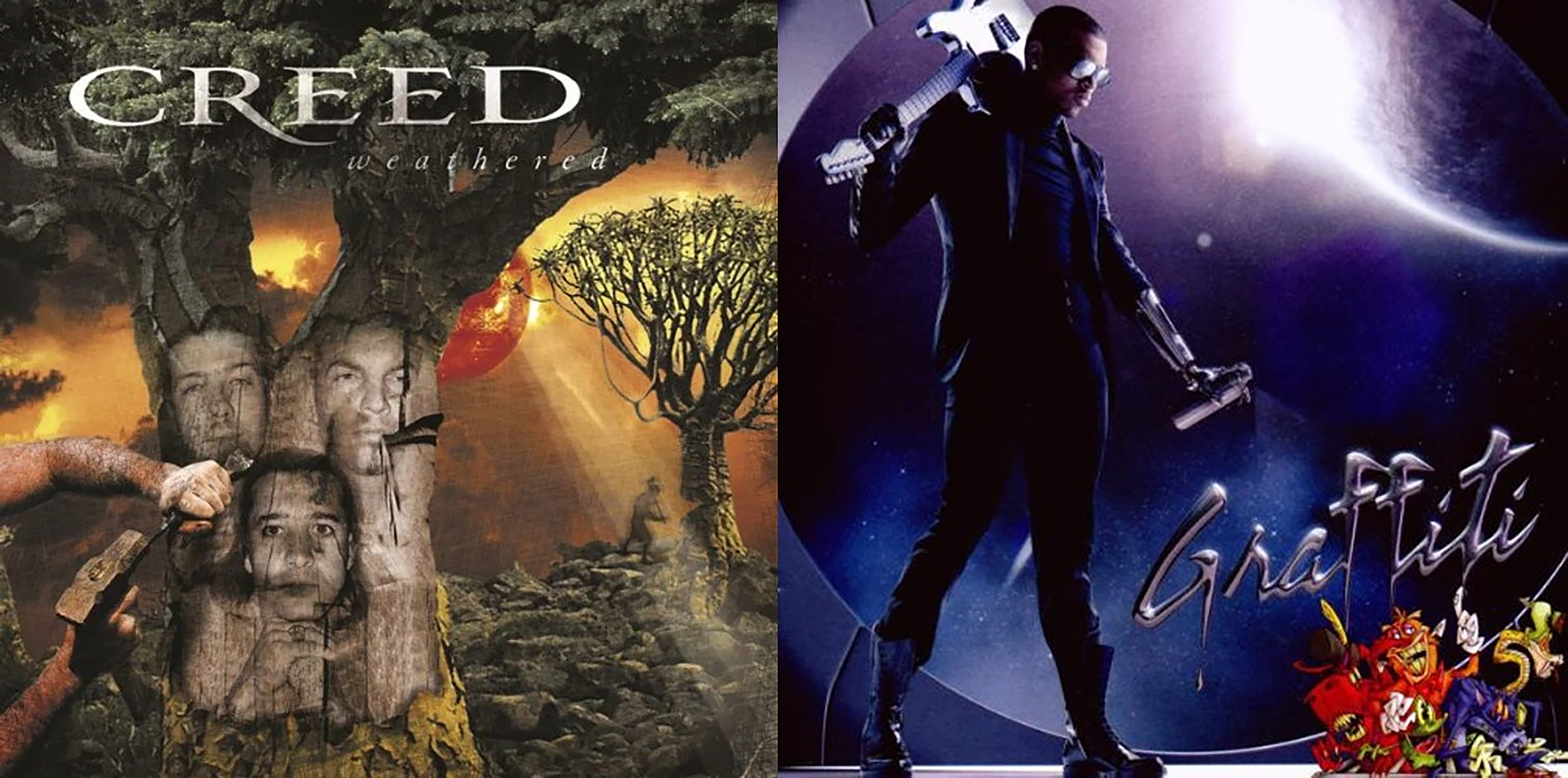
Album covers were brighter and bolder taking cues from album art of decades prior. However, yet again a good chunk of albums from the late nineties and aughts featured cyber-water-chrome-nature-tech-cgi-italic typeface rubbish. I also remember almost every film that came out during this time period having a blueish tint and every male character being totally clean shaven, and sweating every second. A phenomenon I still don’t completely understand.
If any more proof is required on how/why this genre of look is so craptastically terrible one needn’t look any further than the 2021 release of Zuck’s/Meta’s disastrous VR game/platform, Horizon Worlds. Clearly marketed towards Zoomers and Millennials, this cringe inducing metaverse experience wasn’t the success Meta hoped it would be. The platform's lack of compelling content and a generally less than stellar user experience have contributed to a decline in active users, with some reporting a "sensory assault" (I’ll get more into this phenomenon later on) and a general lack of structure. Why anyone would choose to be part of this is beyond me.


Yeah, sure a lot of design is a bit drab and boring now. However, we have to understand how we got here. Coming out of the eighties we saw a great deal of technological advancements. Computers became more accessible and also became better, and kept getting better. Computer processors, software, and graphic cards only kept improving through the aughts. Companies and advertisers quickly understood the opportunities available to them and began to take advanage of this newly accessible technlogy developing graphic generated pseudo-realistic images for everything from advertisements to marketing collateral to logos to album covers to operating systems. Corporations attempted to out do each other with what they could visually come up with.
Eventually everything presented to us became too maximalistic and overbearing. We immediately found ourselves staring at desktop PC images of cyber aquatic landscape nonsense or physically engulfed in them at retail environments. A constant overload and bombardment of bright and piercing visuals and stimuli. It didn’t help that attention spans were gradually decreasing around this time too. Prior to all this there was, I would say a design backlash already happening to all this visual slop of the with a more cleaner, metro, and minimalistic approach. Additionally, corporate entities/companies just stopped being as daring with their branding and marketing inpart due to the economic crash of 2008.
That’s not to say there isn’t great design happening now. Camille Anne Ferreol and Mike Perry come to mind. And that’s definitely a good thing because the design aesthetic of decades past isn’t the visual utopia some people are purporting it to be.